
My Role: Designer, Video Editor, Art Direction
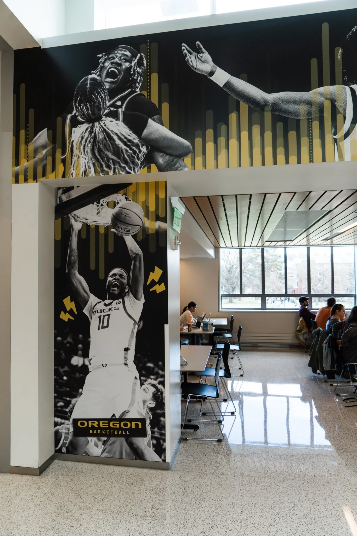
After a crushing defeat brought the end of our historic 2024 Football season, Duck fans were in search of something to put the wind back in their wings. Lucky for them, both UO basketball teams surged at the start of the season, remaining undefeated for an entire month. What did we do to support their efforts? We designed a 65 foot banner fit for the food court in the Erb Memorial Union, the center of student life on campus. The banner displayed a collection of the most emphatic, impassioned moments of the season thus far. The piece functioned as a window into the pandemonium of Matthew Knight Arena, serving as an open invite to join the madness. Read more about our process in this Daily Emerald Article.


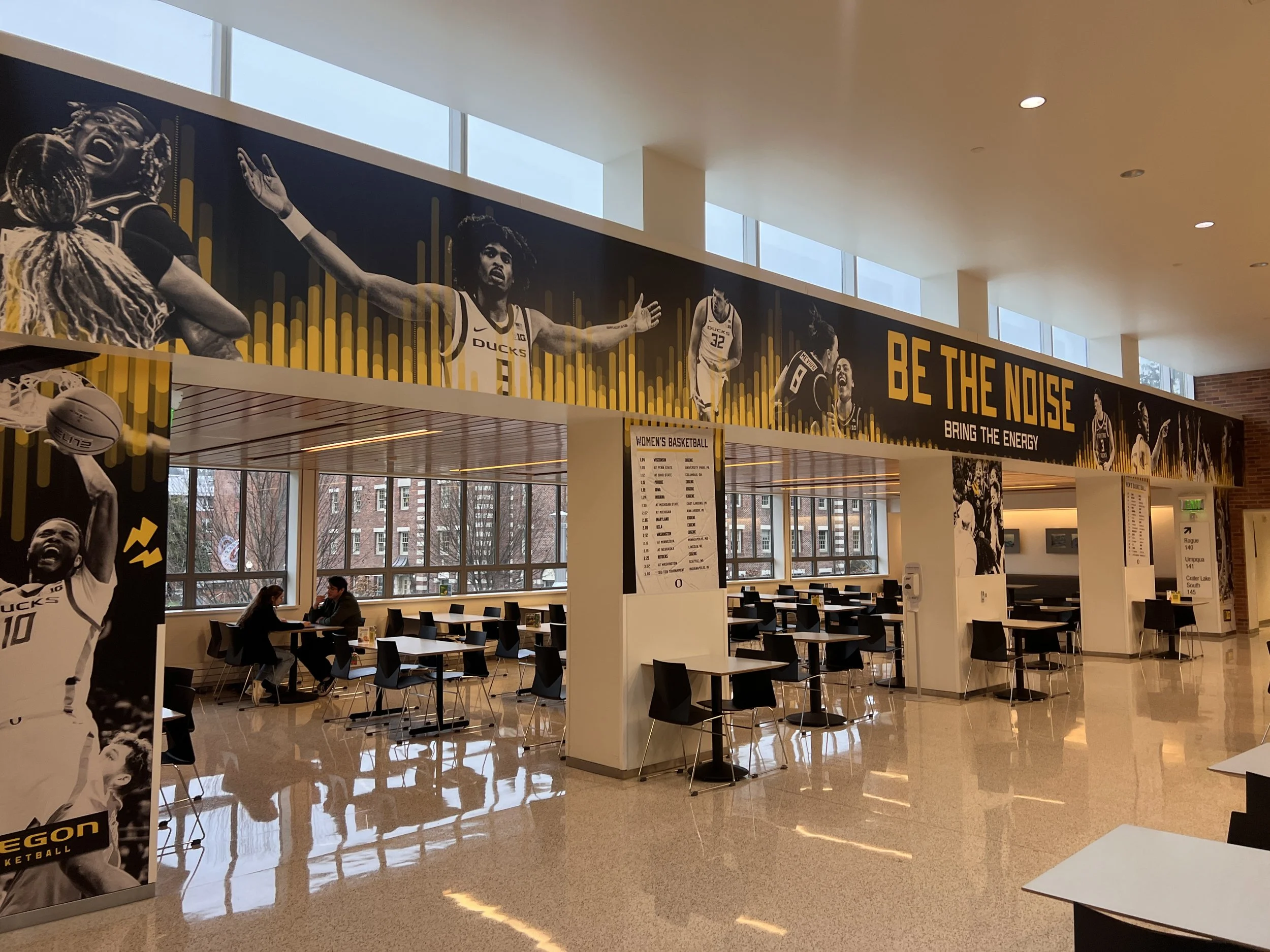
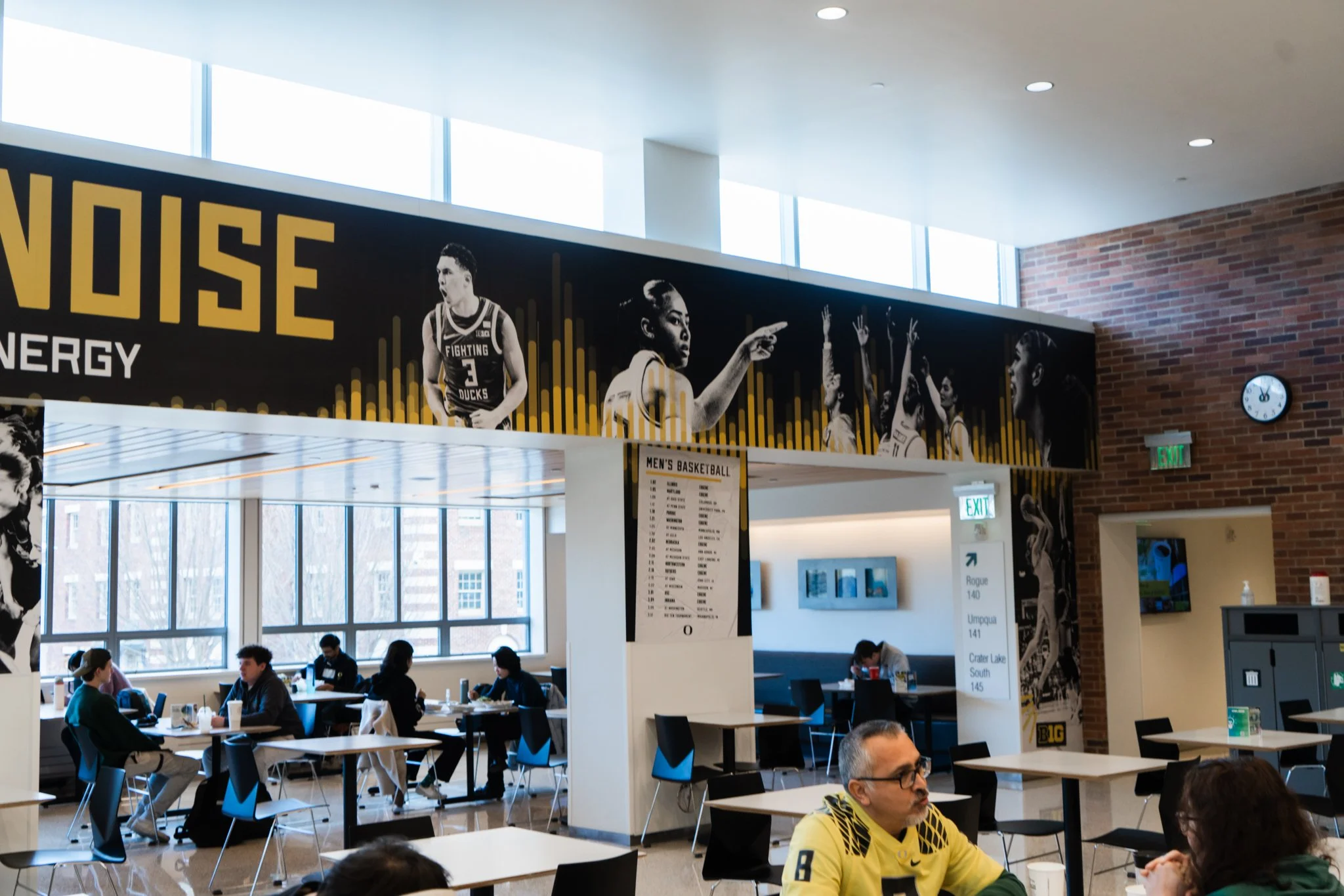
Be the Noise.
Down the stretch, we aimed to be the spark plug that keeps the adrenaline pumping through Duck fans. We brought the atmosphere of Matthew Knight Arena to the TV screens of homes throughout the PNW in an attempt to rally the greater population of Oregon as the days count down to March. With the clock winding down, we urge the flock to come in clutch with their support.
Our commercial airing on Pacific Northwest ESPN channels during the Boston Celtics vs. Denver Nuggets NBA game.
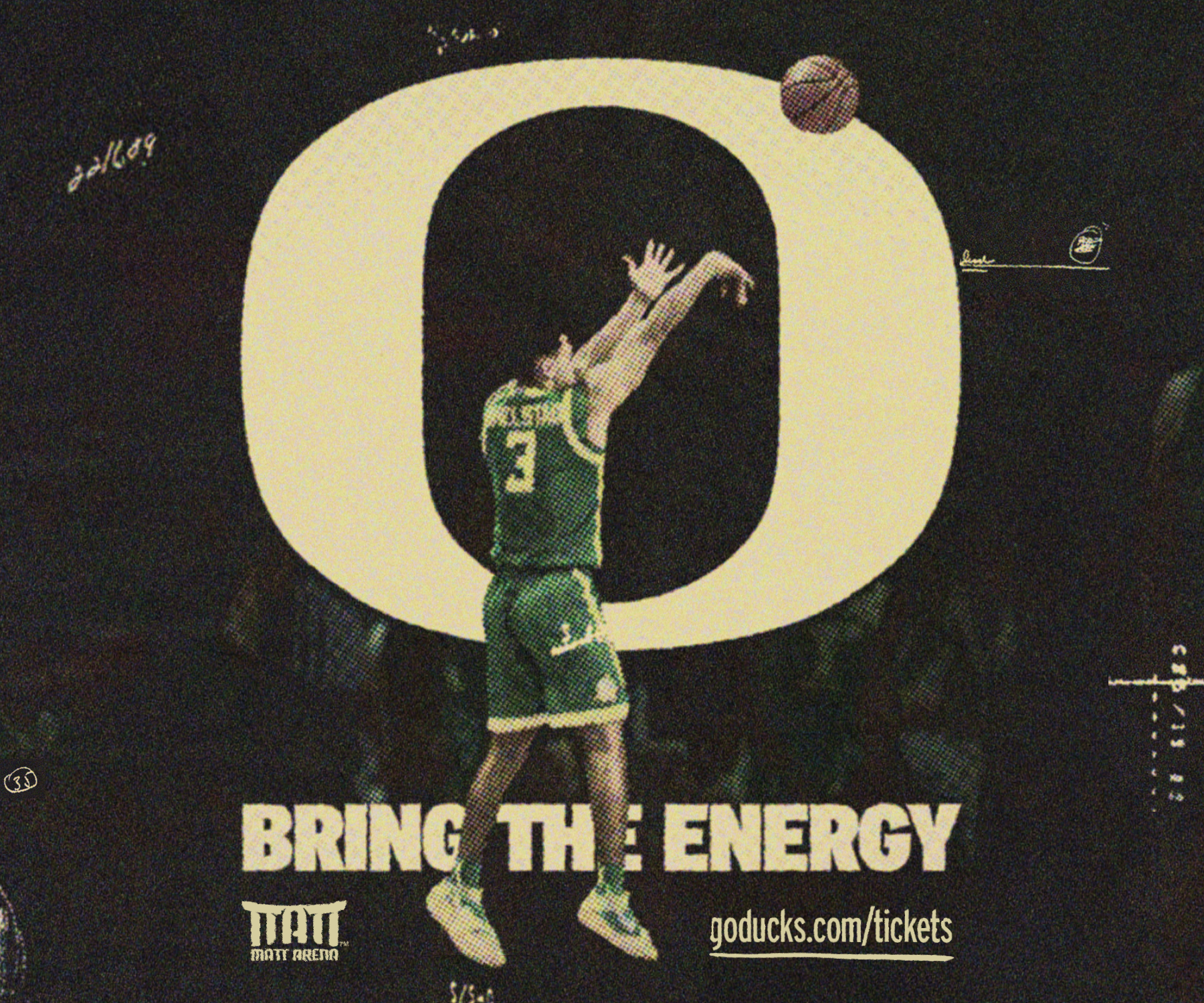
The commercial placement required a Digital Billboard to accompany it, so I took the most most memorable moment of the video and immortalized it in print.
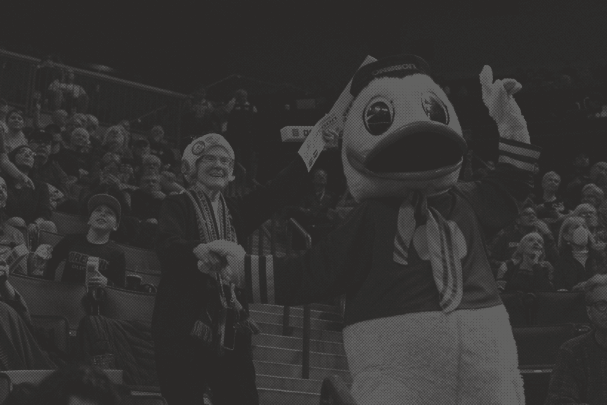
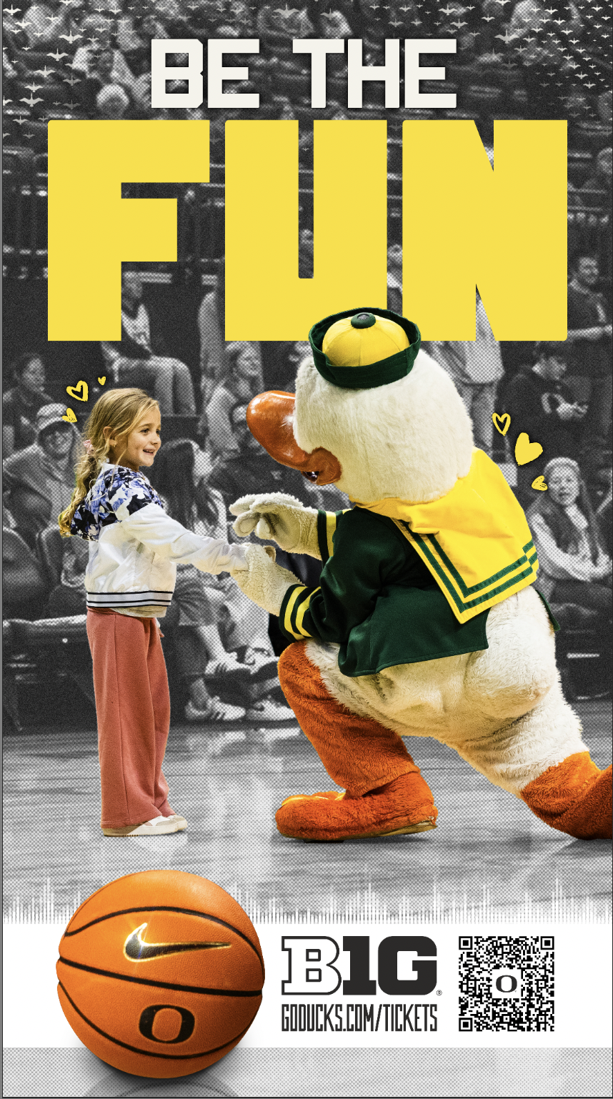
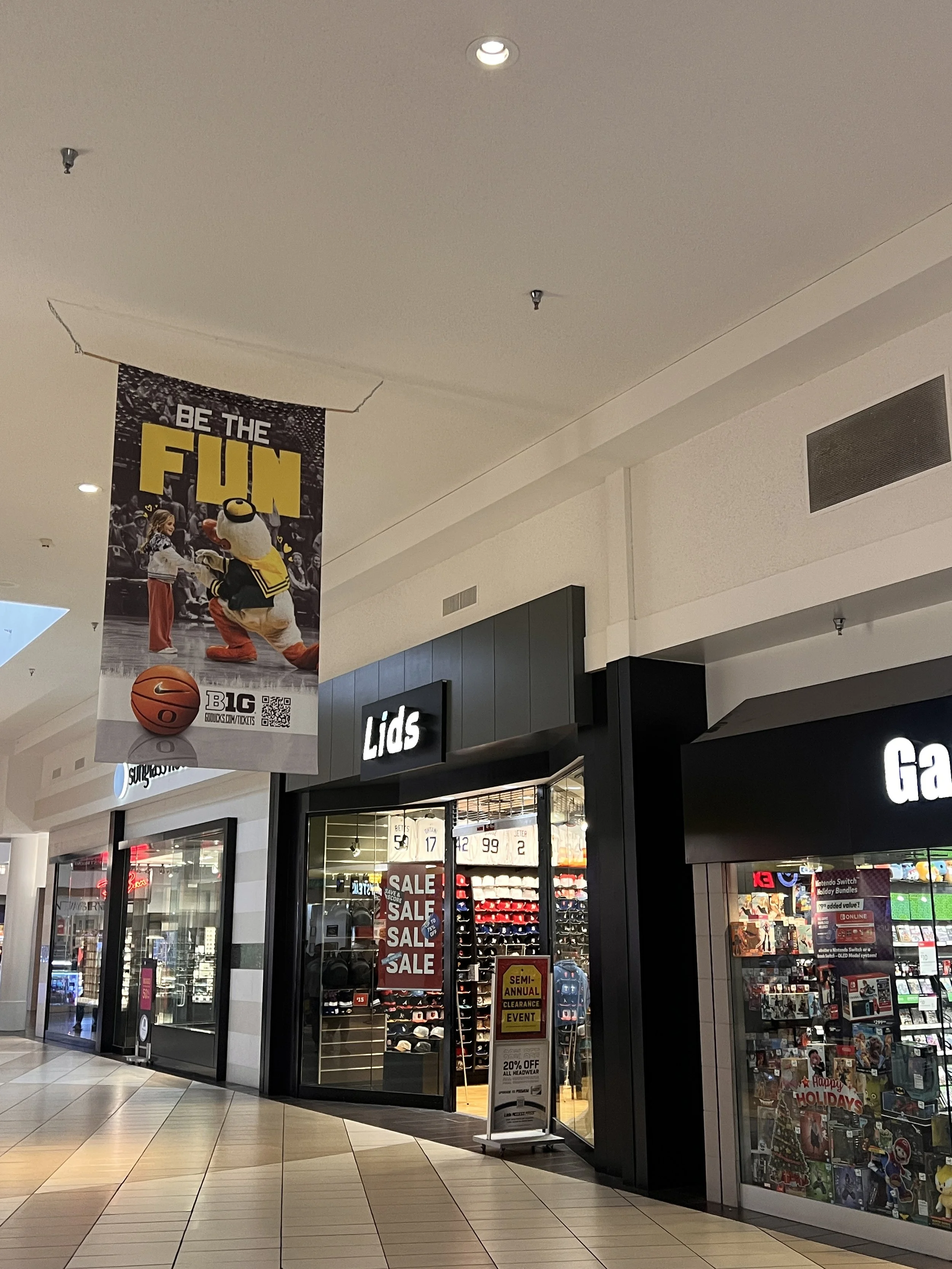
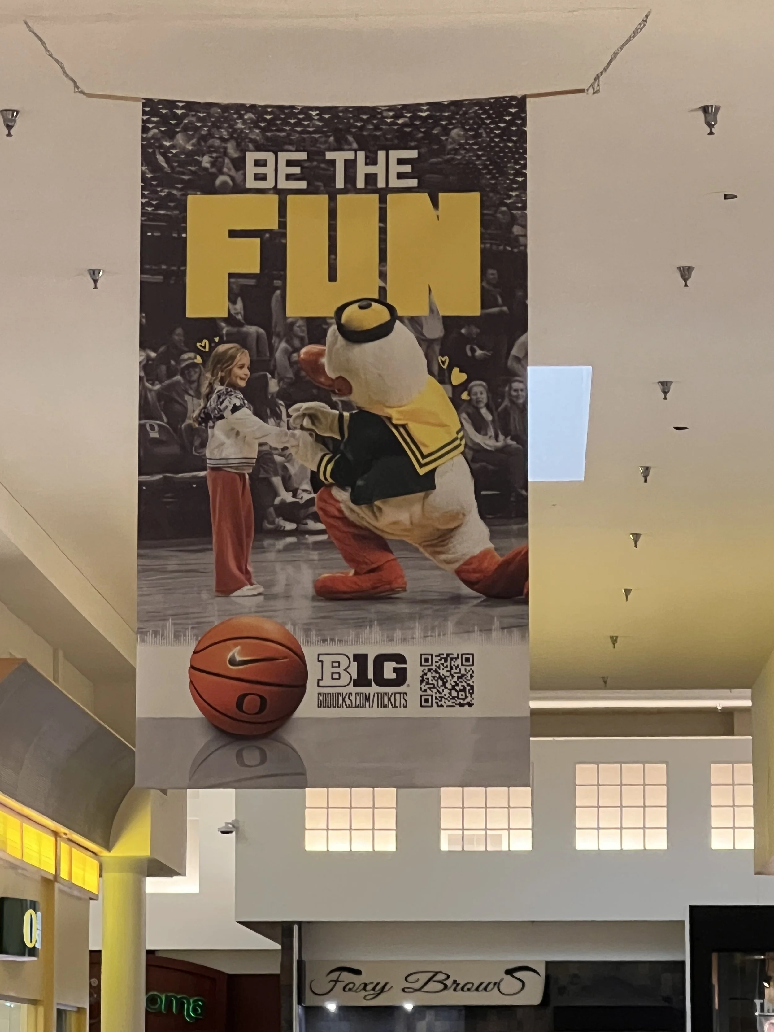
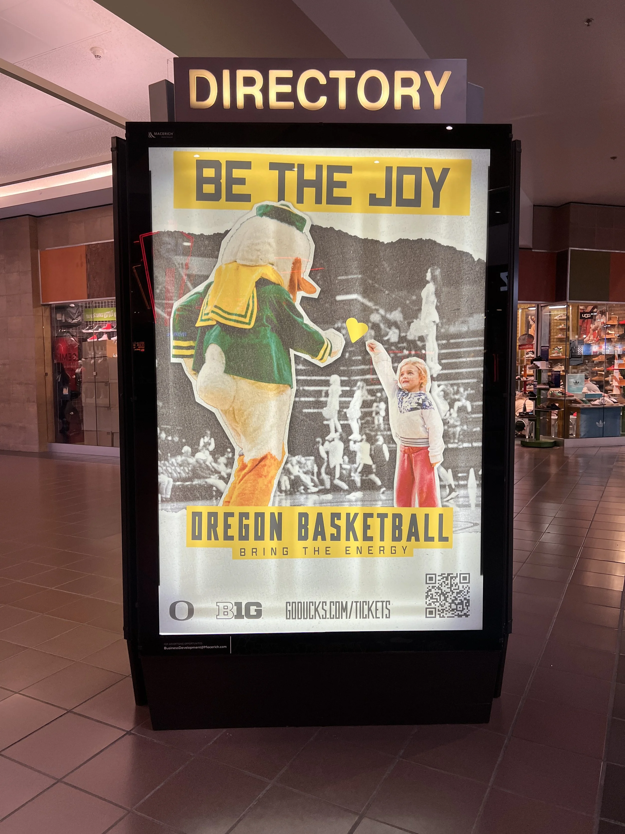
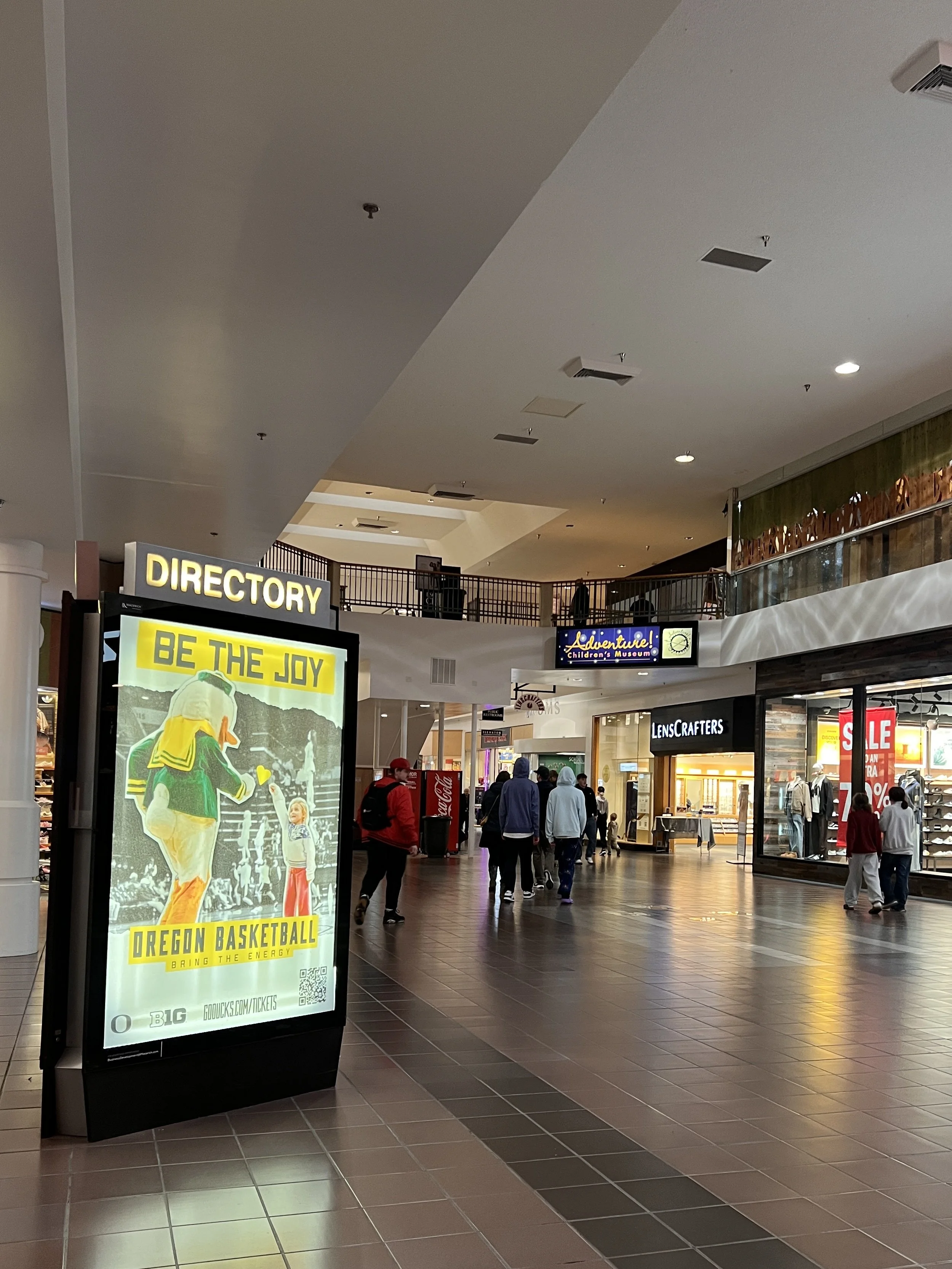
A loyal audience that deserves recognition are families with young Duck fans. Our mascot, Puddles, always does his best to engage with and inspire the next generation of basketball fans, so we decided to follow suit and establish the culture early. These banners, located throughout the local shopping mall, aimed to show the softer, more wholesome side of UO Basketball shenanigans.

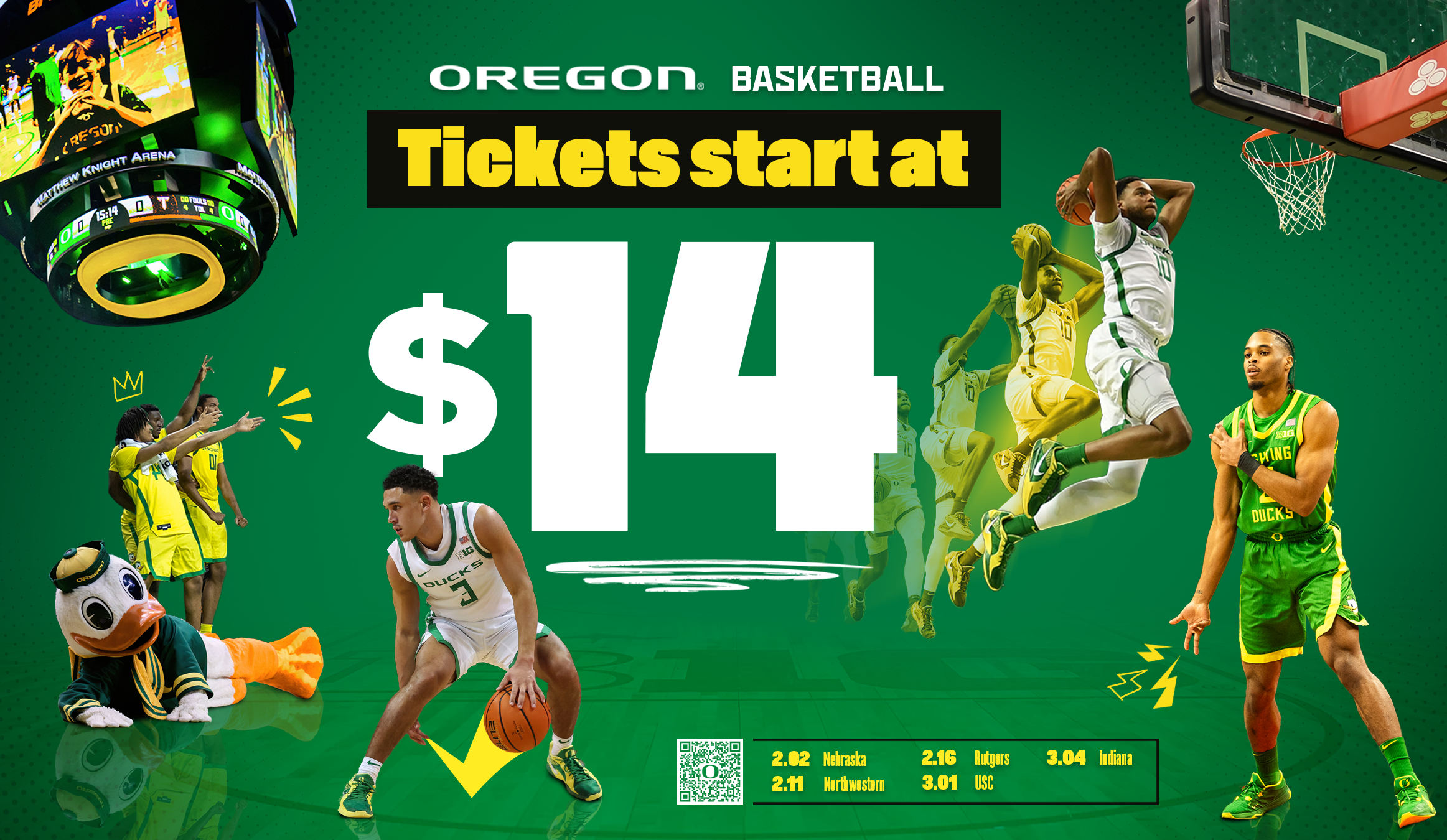
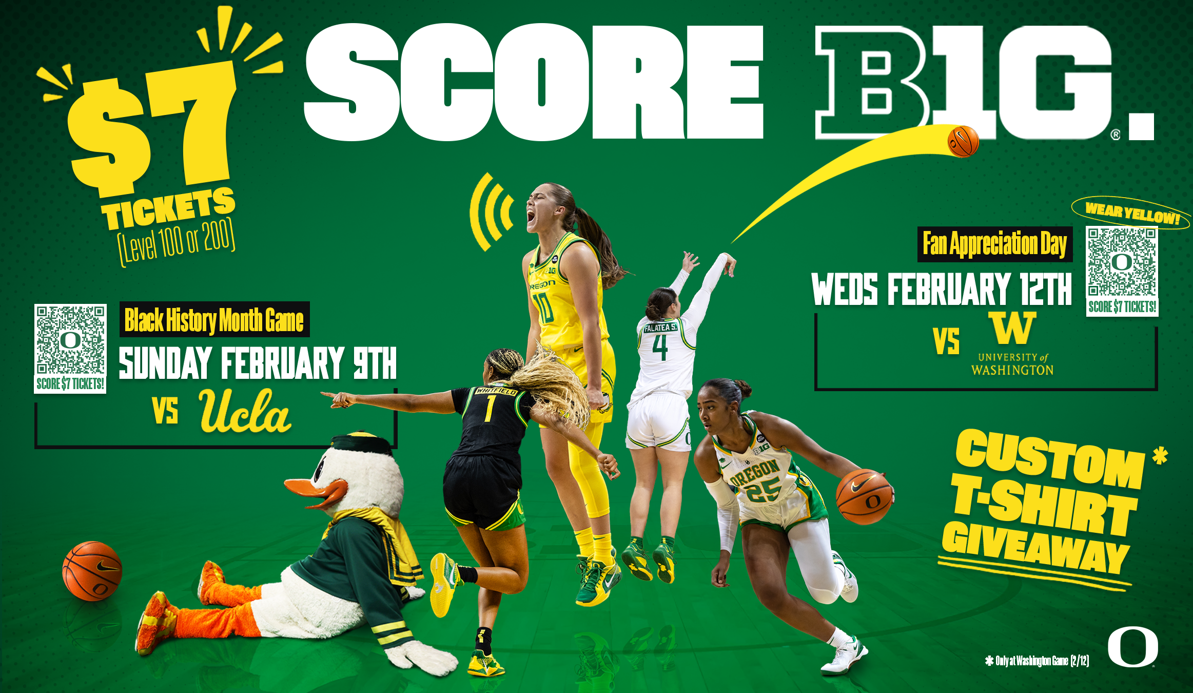
MAILERS
To highlight cheap ticket deals, important ranked matchups and/or special themed nights at MKA, informational print mailers are sent in the mail to Oregon residents. Due to the massive variation in the demographic of mailer recipients, the graphic needed to be all-encompassing and agreeable.
The paper we printed on was thin and glossy, so rather than continuing the theme of retro looking, highly textured graphics, I settled on a more modern look that still utilizes the yellow symbols of emphasis.